


Darigold
Question
How do we stand out in the dairy aisle without losing the clarity of a wellness message?
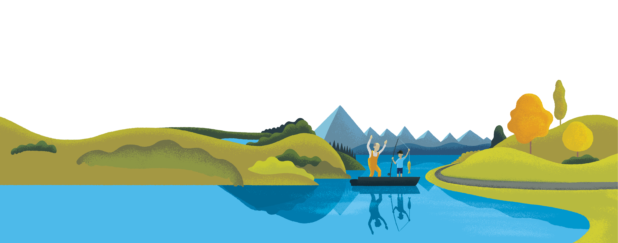
Solution
A suite of custom illustrations brought movement, rhythm, and energy to the packaging—differentiating Darigold FIT from competitors while reinforcing its health-focused identity.
Project Details
Client: Darigold
Creative Director: Scott Ralls
Senior Designer: Chrysta Torres
Services: Design, Illustration
Discovery & Brand Alignment
Darigold FIT is a high-protein, low-sugar dairy option designed for health-conscious consumers. At the time, most dairy packaging relied on sterile branding or simple product imagery.
Invisible Element collaborated with Creative Director Scott Ralls to explore category norms, identify visual opportunities, and align on a creative direction that communicated energy, function, and approachability.

Illustration Development
A visual language was developed using simplified human forms, expressive linework, and vibrant color palettes. Each element was designed to evoke motion and vitality without relying on dated fitness cues or gendered tropes.
Through iterative sketching and testing, the final style achieved a balance of clarity and dynamism, positioning FIT as bold, fresh, and functional.


Packaging Application
The illustrations wrapped around each carton, creating visual movement across multiple SKUs while maintaining consistency in form and tone. Each variant stood out on shelf through its own colorway and layout, helping Darigold redefine the look and feel of wellness in the dairy aisle.
Since launch, the visual approach has been echoed by other brands across the category.


